About Me
Global Technology Client
Superbowl
ID Gradients
Card Savings
EMEA GC Launch
Pay Holiday
Cash Platform Campaign
Other Work
Ghost Drops
Google
Custom Academics
RIOT Energy
22Red
Exxel Outdoors
The Morgan-Wixson Theatre
Outdoor Brands
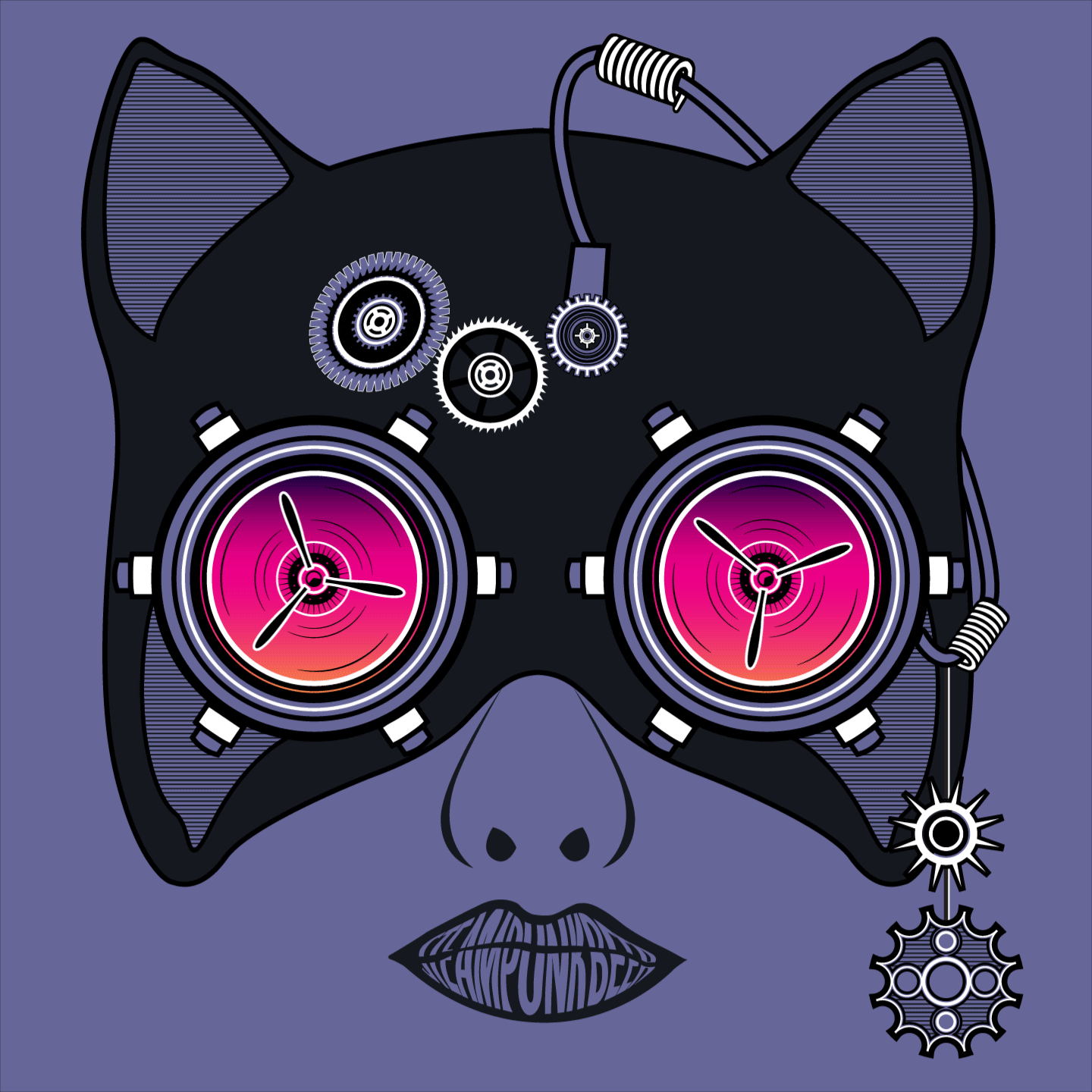
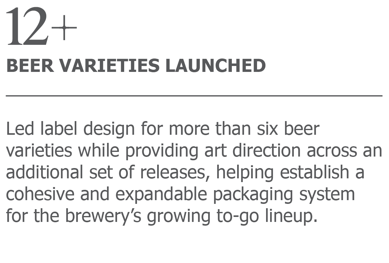
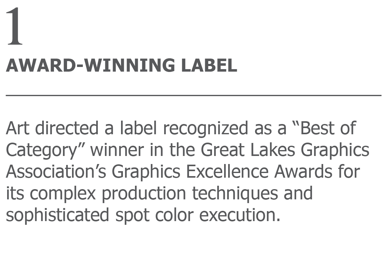
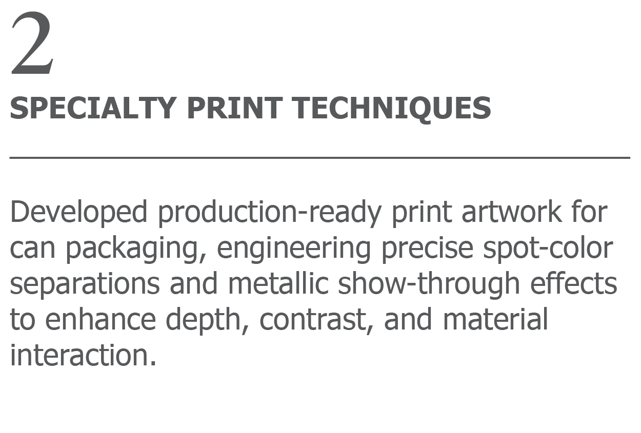
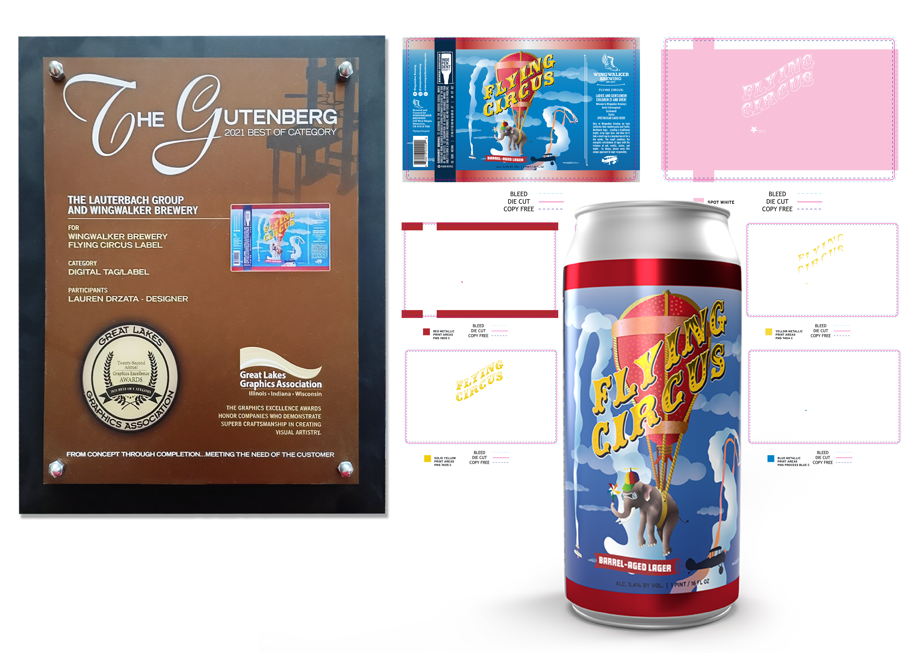
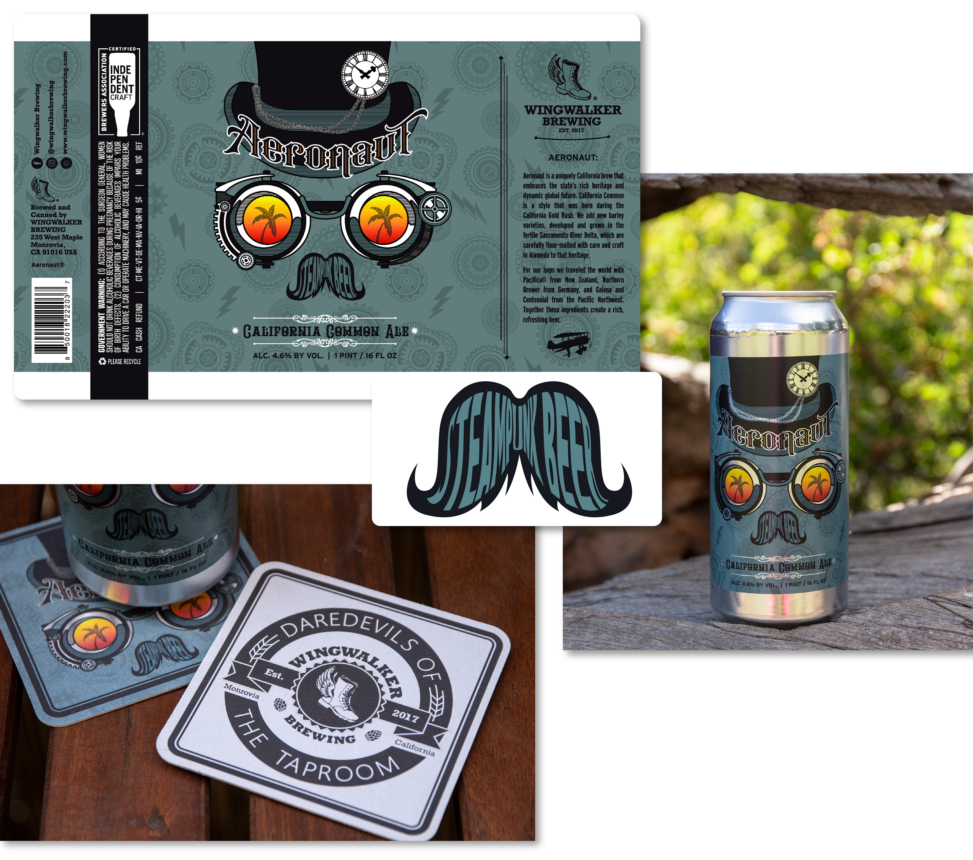
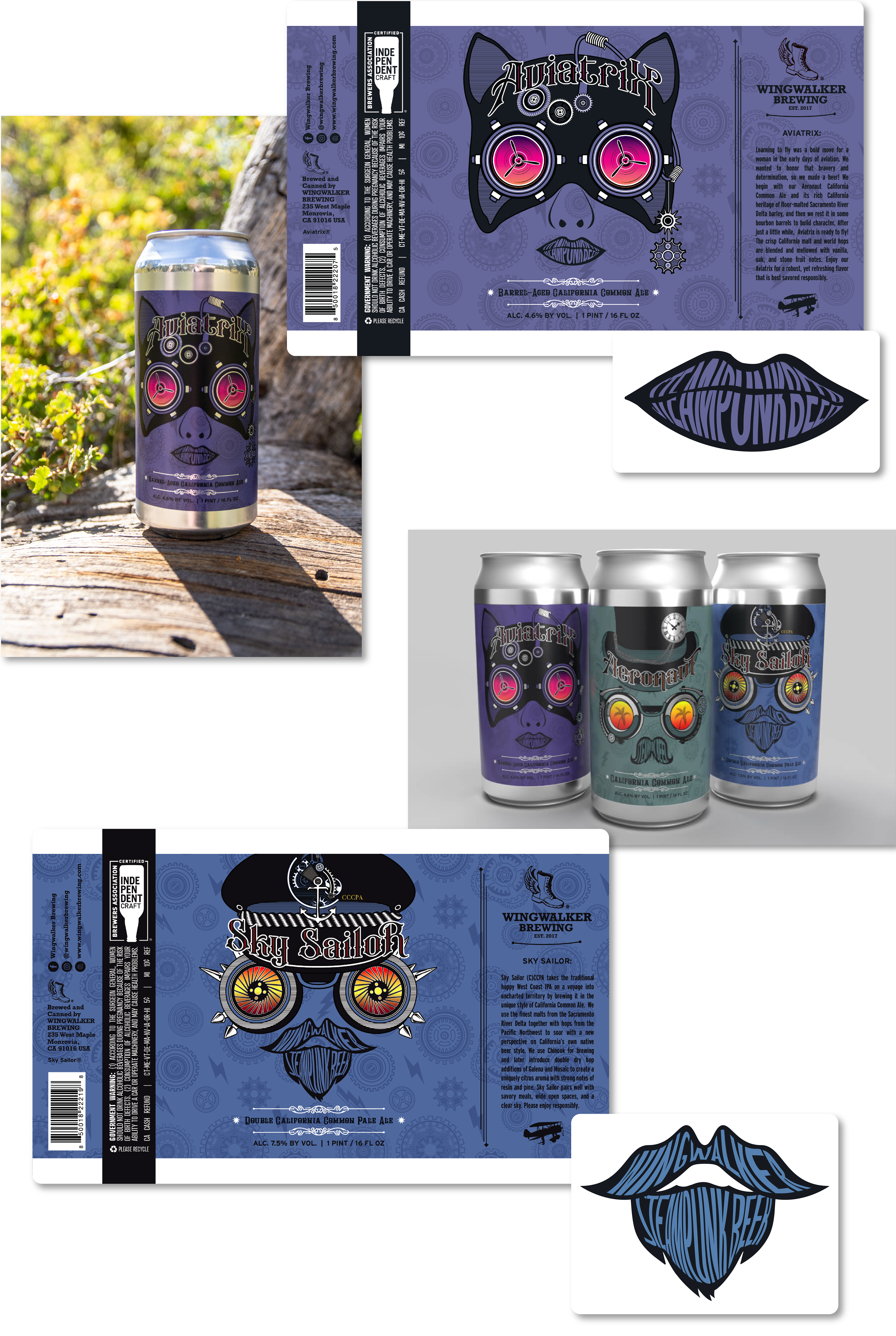
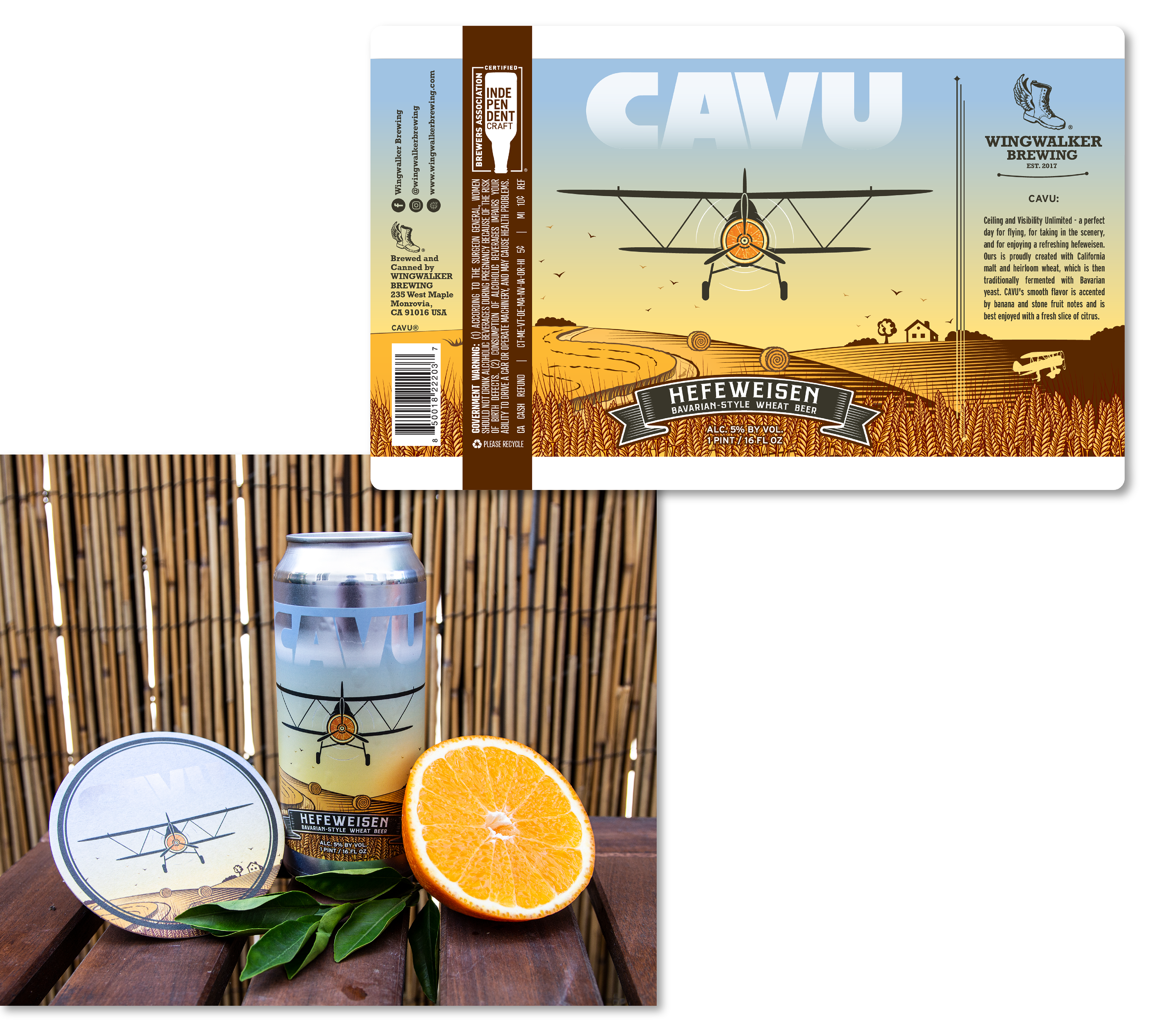
Wingwalker Brewery
Contact
Lauren E. Drzata
About Me
Global Technology Client
Superbowl
ID Gradients
Card Savings
EMEA GC Launch
Pay Holiday
Cash Platform Campaign
Other Work
Ghost Drops
Google
Custom Academics
RIOT Energy
22Red
Exxel Outdoors
The Morgan-Wixson Theatre
Outdoor Brands
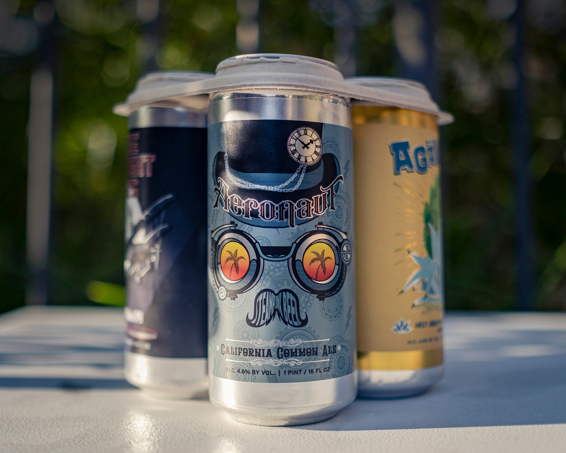
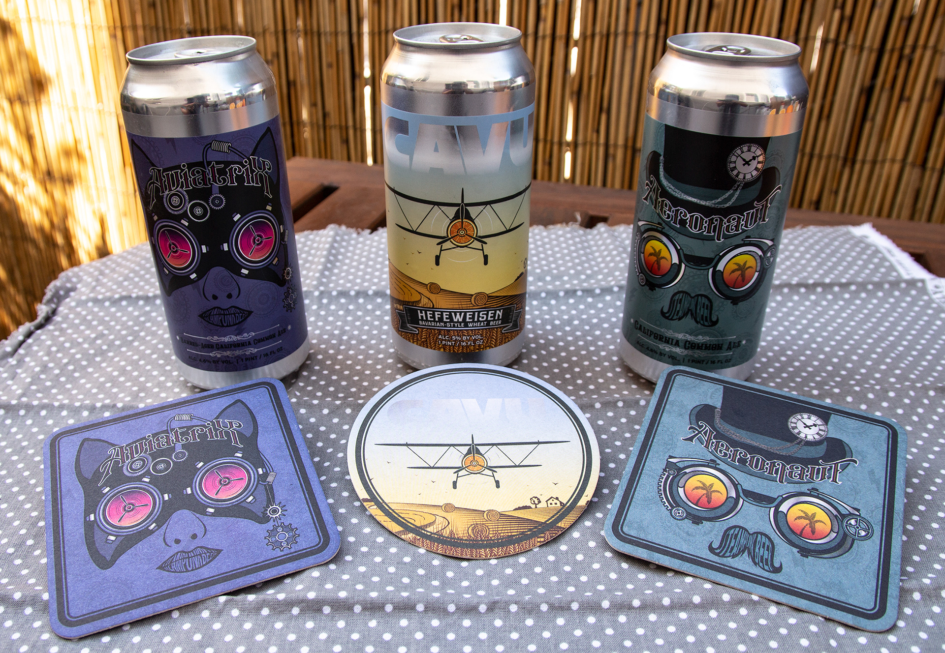
Wingwalker Brewery
Contact
Wingwalker Brewery
Led the creative development of a new retail packaging initiative for a craft brewery, combining label design, art direction, production prep, and supporting collateral into a cohesive consumer-facing brand experience.
↑
Back to Top